case study>design>Logo
KAYA HERBAL

Logo & Concept
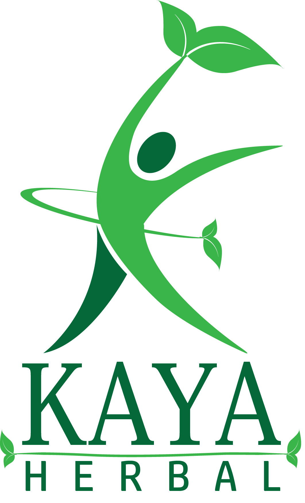
Kaya Herbal required an energetic symbol for their brand that represents energy and enthusiasm through beauty and wellbeing. The women’s posture symbolizes on the top emotion along with success, enthusiasm and energy. The colors and other elements of the logo supply visual information of the product in a symbolic form.
CLient
KAYA
Services
- Logo design
- Branding
Deliverables
- Images
- Illustrations
- Vectors
Other
- Website
- Social Media
Website
WIP
COLOR

#39B54A

#39B54A
Typography
Aa
Palanquin Semibold 32pt
Palanquin Regular 24pt
Palanquin Regular 16pt
Palanquin Bold 14pt
Vestibulum ante ipsum primis in faucibus orci luctus et ultrices posuere cubilia Curae; Donec velit neque, auctor sit amet aliquam vel, ullamcorper sit amet ligula. Cras ultricies ligula sed magna dictum porta. Mauris blandit aliquet elit, eget tincidunt nibh pulvinar a. Sed lectus nibh.
Aa
Actor Semibold 32pt
Actor Regular 24pt
Actor Regular 16pt
Actor Bold 14pt
Vestibulum ante ipsum primis in faucibus orci luctus et ultrices posuere cubilia Curae; Donec velit neque, auctor sit amet aliquam vel, ullamcorper sit amet ligula. Cras ultricies ligula sed magna dictum porta. Mauris blandit aliquet elit, eget tincidunt nibh pulvinar a. Sed lectus nibh.
Submark Logo

