Case Study>
Design

OxyRise
The brand requirement was to create a trending logo design that could hold its ground in the bottleneck competition from brands like Bisleri, Kinley, Aquafina & Bailey
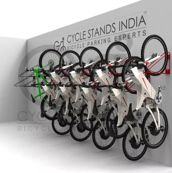
Cycle Stand India
The acronym i.e the initial letters of the Brand name are used as the word mark in the logo unit. The unique styling of the letterforms acts as a mnemonic device for the brand name
FYN
The brief was to create a logo with an acronym and a clock symbol to form a single logo unit. A clock is a symbolic representation of timely delivery and punctuality

DSJR
Make your sweat your best accessory! This sports apparels brand needed a bold logo to create a definitive mark in fitness and sports arena. DSJR sports acronym of the names of its core team members

Kidzencia

Kaya
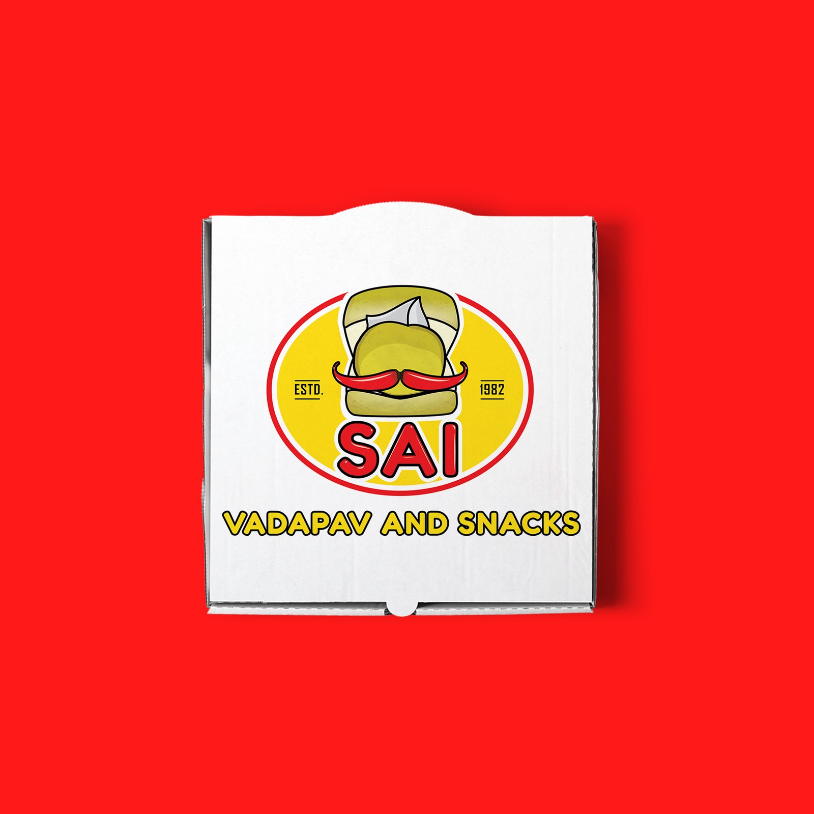
SAI VADAPAV AND SNACKS
The requirement was to create a trending logo design for a brand that specializes in Mumbai’s favorite food – Vadapav! We have used bold fonts to make the logo stand out. At the same time the logo had to be distinctive yet easy to remember.
